Beautiful equations

It was while working in her garden during the first lockdown that designer Rebecca Kaye was struck by the number of birds flocking to her bird-feeder, and the variety of colours in their plumage. Inspired by her love of exploring the natural world through maths and design, Rebecca set out to discover exactly how much colour she was seeing through these avian visitors, and translate the data in a stunning piece of visual art…

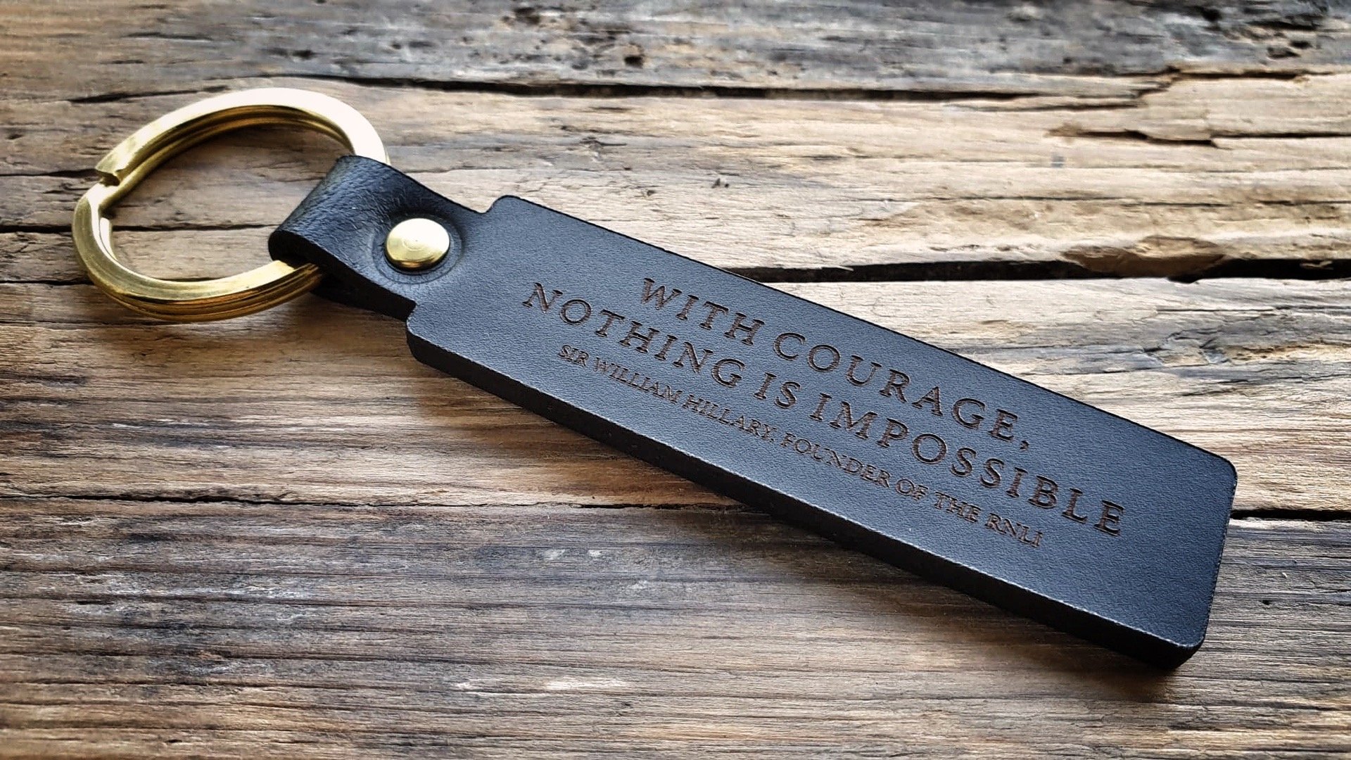
Bird Colours Lithograph, by Ploterre

Mathematics, design and the natural world – what led to your harnessing these three things for creating your products?

It feels more like a long, scenic loop rather than a journey to somewhere new. I say that because when I was growing up, the three things I loved more than anything were maths, art and being outside. For various reasons (school timetables preventing you from studying both maths and art, and jobs being very much maths or art based, barely a combination of both), I had to veer off-course before finding my way back.

The loop essentially involved my studying maths, then working with data, then studying design before pretty much giving up my spare time to work in data by day and design by night. This was when I lost my connection with nature.

However, through perseverance over many years, I eventually found a way back to the place I always wanted to be.

What's been the most surprising part of your journey creating Ploterre?

It’s realising how much I love doing what I do. I’ve tried a variety of things in the past that involved an element of both maths and design, but I never felt satisfied. Since coming up with the idea behind Ploterre, blending both design and data – and only using environmental data – I’ve never been happier. It’s the perfect combination of spending time poring over data on a subject that’s really close to my heart, then having the privilege of bringing that information to life through design.

Tell us the story behind your Bird Colours Lithograph – what inspired it, and what was your creative process?

This was pretty much a result of lockdown. As with many people during that time, I found refuge in nature. I’m lucky enough to have a garden, and I set up a work space in front of the bird feeder. Watching the birds fly in and out of the garden made me realise there were so many colours darting across the sky. My mathematical mind wanted to know exactly how much colour I was seeing, and that sparked the idea behind the print.

Rebecca’s lithograph charts the colours from the top 20 most commonly sighted birds in British gardens

What is it about mathematics and data you find so compelling?

I’m very solution driven – both in my personal and my work life. I like the fact that maths always has a solution. This is similar with design. There may be a variety of ways of addressing and answering a problem, but you know when you’ve solved it, at least in your own way.

As an example, for the Birds Colours Lithograph, I set out to find out the most frequent visitors to UK gardens, which I found via the British Trust for Ornithology and their Garden BirdWatch survey, and the proportion of their body covered in specific colours (using illustrations from the RSPB). Once I’d decided on a formula to bring these two bits of information together, I’d solved my ‘problem’.

Do you have a favourite piece from your collection?

The Bird Colours Lithograph is one of my favourites because I spent a lot of time working with the data and bringing a variety of information together. It was the process I enjoyed more than anything else. It was also a slightly different output from my other prints – I allowed the process to lead the design and I didn’t set out with a rigid idea of the end product.

Are there any projects you're currently working on you'd like to tell us about?

There are a few new pieces I’m working on that are similar to the Bird Colours Lithograph in both style and process. Most of my work to date has been quite illustrative, showing mountain visuals to describe mountains and illustrating a bothy to communicate bothies. However, my new pieces are more abstract in design and more time-intensive in research. I really enjoy the lengthier research process, and allowing that process to drive the designs. It was the bird print that really opened my eyes to that way of working.

Where do you turn for inspiration, particularly when you're in a creative lull?

Outside! I often find I’m in a creative lull when I’m busy and feel like I don’t have time to go for a ride on my bike or spend time in the sea. But those are exactly the times that I need to be outside.

Without fail, I return from the outdoors refreshed, inspired and so much more productive with my time than if I’d remained at my desk, staring into space.

Tell us about your work space – how does it reflect you?

My studio is a room in my house with two windows, both overlooking trees. I’m based just far enough out of Edinburgh that it’s still easy to visit – for all the amazing galleries – but I also have a view of the Pentlands and close access to the sea.

Since moving to Scotland almost 20 years ago, I instantly fell in love with the country but I don’t think I quite appreciated how much variety of the natural world (from mountains to coastlines and rivers to fields), Edinburgh has on its doorstep.

What's on your bedside table?

Books and lots of them. Predictably, they nearly all revolve around the outdoors. My favourites over the past few months are Homesick by Catrina Davies, Afloat by Danie Couchman, Things I Learned When Falling by Claire Nelson and A Boy in the Water by Tom Gregory.

Discover more of Rebecca’s work at ploterre.com

An unseen world

While completing a PhD in molecular biology, Abid Javed was compelled to find a three-dimensional medium to communicate his research. Marrying molecular forms with Arabic script and geometry in his sculptures, Abid is bringing an unseen world into focus.

Images courtesy of Abid Javed

Abid, why did you choose ceramics and sculpture as a medium for communicating your work?

I wanted to initiate a dialogue, to create a connection between us and a biological world that is invisible to the naked eye. Sculpture was the obvious choice because of the shapes of the molecules I took as reference points, and the room for abstraction in sculpture design.

Can you tell us more about the nature of your studies in molecular biology? What were you researching?

For my PhD, I was looking at a molecular machine called the ribosome and how it is not only responsible for synthesising the basis of life (active proteins) but is also involved in folding proteins and giving them shape. This aspect of my research – looking at how proteins take shape – inspired the shapes and forms in my sculptures. I then went on to look at how viruses replicate their genome during their multiplication cycle. This introduced me to a whole new world of DNA and viruses, which triggered me to develop my current collection – Pleomorphs. I’m still actively involved in this research, which continues to inform my artwork.

Do you think there should be more of a multidisciplinary approach (such as the bridging of science and art, in your case) in the way we problem-solve and understand the world?

Yes. From my own experience, it shows that there can be a beneficial crossover between different disciplines. It just needs some guidance and development to make that bridge. During my research, I learned the benefits of multidisciplinary research early on, having to work with different methods and finding a way to integrate them. Also, a scientific mindset in design helps to understand the basis of materials and the processes that lead to the final object.

What do you love about working with clay?

The fact that it’s malleable. Also, that each clay body has its own character; it’s own way of working with it. That’s what I’ve come to love – mixing different materials and figuring out the best use for it when designing pieces. I also love the raw surface textures of the pieces after they’ve been fired.

How have the past 18 months or so changed your everyday rituals and rhythms?

My daily rhythm has definitely slowed down, which has allowed me to connect more with myself and my surroundings. Before the pandemic, I had a very busy working schedule, constantly commuting within the city and struggling to balance different aspects of my life. The lockdowns made life a little slower and a little more conscious for me. The benefits of this I can see in my day-to-day lowered stress levels, and I’m managing my time better. I’m not saying I don’t miss grabbing that morning flat white and heading to the office, but it’s a welcome change to move away from that ritual.

What is the next phase of your work?

I am currently developing my next phase entering the furniture design field. The idea is to explore and combine my sculptural forms and natural materials, and design objects in a way that would introduce the molecular world into living spaces. This would stem from my existing sculptural designs as well as building on some new work.

Aside from molecular biology, what inspires you?

My own cultural heritage, exploring Islamic arts and my Chinese cultural roots. I also find Japanese sensibilities quite attractive, being conscious of the natural world. And of course 20th-century art and design was a a sheer explosion of creativity I’m very inspired by.

Tell us about your studio/work space, how does it reflect you?

I’m currently in a shared studio space, where I have my own little corner. I’m not the most organised and neat person as I like to see my tools and references in front of me, but I do find getting organised before starting each piece afresh helps.

What's on your bedside table?

One of my sculptures, a paper lamp and some art and photographic monograph books to flick through.

Discover more of Abid’s work at abidjaved.org

The Natural Ink Project

Welsh artist and writer Kathryn John shares insights into her practice making ink using pigments sourced from nature, such as rosehips, pine charcoal, avocado stone and oak galls

Kathryn’s black markings with oak gall ink

Kathryn, first of all, what are oak galls?

Oak galls (or oak apples) grow on acorns, leaves and branches of oak trees in reaction to a wasp laying an egg on the tree.

What inspired you to start gathering materials from the natural world to make ink?

I’ve collected things while out on walks for many years. In 2015 I was introduced to the process of natural dyeing by an artist I was training with. She had a beautiful book of her naturally dyed wool swatches. I began researching the process and found it fascinating. I wanted to move away from using synthetic paints in my work, so started to make ink from materials found on my walks.

Why do you like to write and sketch with oak gall ink? How does it feel different to other inks?

The whole process of making and using the ink is a full body, sensory experience. I find it medicinal. Each ink has its own personality, unique smell and texture – when they meet on the page it is a whole different alchemy to other inks.

Tell us about other inks you've made.

I’ve made ink from wild blueberries, blackberries and red dock seeds gathered in the Peak District. Also, yarrow, gorse flowers and roses from the West Wales coast. Blue from copper pipes. Pink from avocado skins and yellows from pomegranate.

What do you enjoy about the process of ink making?

I enjoy how much the process is like being a child again, making potions in the garden. Also, it teaches me a lot about patience. If there’s a particular plant I’d like to work with, I need to wait until it’s in season. It isn't about taking too much of something – the birds, insects and animals rely on this plant too. We are all part of the whole living system. It also feels like a radical act to reclaim a traditional craft in this way and step away from consuming mass-manufactured stuff.

Follow The Natural Ink Project @_kathrynjohn on Instagram

Recreating perfection

What would the “perfect” horse chestnut or pine cone look like? Inspired by his walks in the South Downs, artist Malcolm Trollope-Davis sought to answer this question by keenly observing growth patterns in the minutiae of the natural world around him. He invites us into his Brighton studio to tell us more…

Malcolm Trollope-Davis’ original ‘Technature’ drawing of a horse chestnut

Malcolm, we love the beautiful simplicity of your Technature designs. What inspired you to create them?

This may sound strange but what triggered the concept was spending most of my adult life illustrating, creating, using and being immersed in computer technology. It’s an unavoidable side of my professional life as it allows you to create exceptionally detailed and precise work. I believe our exposure to computers affects the way we think and feel. So accustomed to seeing perfectly created shapes, I started looking for them in nature during my walks in the South Downs.

Of course "perfect" shapes and forms are hard to find in nature (that's the beauty of nature), but I began to observe acorns and other seeds and attempted to recreate their growth code. I counted the spikes on a horse chestnut and studied the arrangement of its pattern. In my recreation of this I drew a perfect spike protruding from its casing every 45 degrees, evenly spaced from each other. Of course you’d never find a chestnut as perfect as that in nature but I guess I was curious to see what it would look like. For my acorn, I gave it a sort of machine-tooled cup pattern. The end results seemed to be a good balance of technical and nature, hence the ‘Technature’ title of my collection.

Do you often turn to nature for inspiration?

More and more, the older I get! There's something rewarding about recreating the things surrounding you. Perhaps recreating it gives you an excuse to just stand still and take the time to really observe it.

For you, what is the most beautiful thing in nature?

I think the freshness and growth. As a human and certainly an artist, it’s important and therapeutic to have a desire to grow and progress (and hopefully improve). Nature never stops doing this and I find that reassuring as I consider myself part of nature. Also, I’m particularly drawn to the patterns you can see in the spread of branches and the number of points on a leaf.

Your Brighton map is a wonder. Can you please tell us about the journey of making this?

I think the map was a project that fell under that ‘describe your surroundings’ concept, but taking the detail to a very high degree. To all intense and purposes, it looks as though you can see every building in the city and far beyond to Shoreham and Worthing. It’s the result of an incredibly painstaking editing process. To give you an example, in a street of 20 identical houses I may only illustrate 10. Why do this? Well, by using this same process all over the map, house by house and street by street, you can make the houses a little bit bigger. All the rooftops and building shapes have been observed and carefully recreated, but because their size is bigger the viewer can decipher the visual information much more clearly than, say, in an aerial photograph. Resident who live on that street can still say “that must be my house” and hopefully buy an art print! Adding moments in history and famous Brightonians from the past also makes the map more engaging and friendly.

Are there any other projects you're currently working on?

Yes, too many. If I’m not careful they can get in the way of paid work. I’ve just finished writing a children’s book. I’ve been illustrating them for other people for years but had this idea running around in my head for a long time. My partner Dörte suggested I just sit down and get it down on paper. I haven’t had it published yet but the few guinea pigs who’ve been kind enough to read the manuscript have been extremely positive. One 12 year old (who shall remain nameless) finished all 160 pages in just a few days. Other than that, I have a folder with over 50 creative concepts ready to roll, from board games to TV show concepts. I just need more time!

Malcolm Trollope-Davis has kindly donated 15 ‘Technature’ gift sets and a limited edition Brighton Map to our Collector’s Edition crowdfunding campaign, which ends on Sunday 12 December. Please consider pledging so we can keep publishing Ernest in 2022 and beyond.

The lifeboat station project

Travelling the coast in a decommissioned ambulance, photographer Jack Lowe is capturing the crew of all 238 RNLI lifeboat stations in the UK and Ireland on glass. At each lifeboat station, he captures three things: the boathouse view (of the waters they’re protecting), a portrait of every coxswain or senior helm and a group portrait of the volunteer crew.

In 2016 – a year into his project – Jack spoke to Joe Stebbing for issue five of Ernest, sharing an insight into his epic tour of the coast, the wet collodion process and his mobile darkroom, a decommissioned ambulance named Neena. Scroll down to read the original article and to find out how the project is going, five years on.


Jack Lowe has put a successful career on the line to embark on a self-funded project to photograph the crew of 238 RNLI lifeboat stations in the UK and Ireland using a Victorian method called wet plate collodion.

The technique is unapologetically analogue, but far from simple. Chemicals are applied to glass, whichis then exposed to light through the lens of his 110-year- old camera and developed in his mobile darkroom, Neena. There is no post-production, and adjustments are made for the slightest change of conditions on the quayside. A single photograph, or plate, can take more than an hour to prepare, compose and ‘make’.

As the plate is developed under the red glow of Neena’s safelights, the reason for the project and his choice of method becomes clear. The plates capture stunning levels of detail and depth, and yet so much more – a plate captures a story and a moment in time, reflected in light and shadow on the sea-weathered faces of its subjects.

JS: How did this project come about?

JL: Let’s call it a midlife correction. I’d reached a point in my life where I had to answer a question: “Do I want to spend the rest of my working days in front of computer?” The answer was an emphatic “No”. So I came up with the Lifeboat Station Project – a combination of my love of photography, the sea and the RNLI.

JS: Why photograph lifeboat crews?

JL: The RNLI strikes a chord for me on many levels.These crew members are volunteers, risking their own lives to save others at sea.They’re embedded in their communities – they might also be fishermen, farmers or teachers. For a rescue organisation to rely on donations and the goodwill of its volunteers is really quite special.

RNLI Minehead helmsmen


JS: Why use the wet plate collodion method?

JL: With this process, I’m making something irreproducible and uneditable.That plate of glass was in the camera, at that location, at that time, and becomes a completely unique photograph. I love that.

JS: Tell us about Neena – she sounds awesome.

JL: Neena is a decommissioned NHS ambulance, hence the name – get it? Built on a Ford Transit chassis, she has a spacious saloon in the back, which I’ve converted into a darkroom. She has two sets of LED lighting (one white one deep red), a fold-down step, extraction fans and she even has an intercom. Basically, yes, she is awesome.

JS: What is the process from lens to finished plate?

JL: First, I pour a chemical called collodion onto the centre of a piece of polished glass. I direct the liquid to each corner of the plate – this is called flowing the plate. The collodion needs to reach an optimum set point (before it starts to dry) so I can place it in a light-tight box containing silver nitrate. Here, a chemical reaction takes place, which makes the plate light-sensitive.

After three minutes, I switch on the red light for darkroom conditions. I draw the plate out of the silver nitrate and place it into a holder designed to fit on the back of the camera. Once loaded, I carry it from Neena to the camera – bear in mind that might mean marching 250m along a pier! I fit the plate holder onto the back of the camera, make the exposure, then take the holder back to Neena.There, I pour developer onto the plate and the image appears within seconds as a negative.

Once development has been halted with water, I open the door for the truly magical part: I pour fixer onto the plate.The ‘oohs’ and ‘aahs’, and even tears, from the crew come thick and fast as the plate transforms from negative to positive before our eyes.

The process produces a 12x10in ambrotype – a positive photograph on a plate of glass.

Five women of RNLI Clovelly, Devon


JS: Victorian photographs of sea faring folk seem to offer a true glimpse of the subjects’ character – do you see this emerging in your photographs?

JL: Yes, definitely.The photographs become a facet of the humility and generosity that exist within coastal communities and these lifeboat crews.

I’ve been most struck by the coxswains. Many have held their position for years – some are even the second or third generation.They have a calmness about them that can really take you aback.This reflects really well in the photographs – they seem to have an exceptional talent for standing still during the long exposures!

JS: What will be the outcome of this project?

JL: Eventually, this will form a book and an exhibition of over 700 photographs documenting the RNLI. I hope it will be a worthwhile legacy.

We spoke to Jack for issue five of Ernest (2016), when he was one year into his project. Since then, his journey has unfolded in unexpected and remarkable ways. Five years and 150 lifeboat stations in, Jack’s coastal travels came to an abrupt pause when social distancing restrictions were announced in March 2020. Taking the opportunity to reevaluate his project, Jack built an independent membership platform called The LSP Society, then went on to develop an app for iOS and Android where members can connect, access extra films, audio, blog posts and online talks, while helping Jack to see this historic odyssey through to completion.

Jack has kindly donated 15 sets of limited edition postcards and five limited edition prints of Longhope Slipway to our Collector’s Edition crowdfunding campaign. You can pick up one of these sets and prints on our campaign page, or you can browse the entire collection on the Lifeboat Station Project website.